Paul Rand Collections/Critique
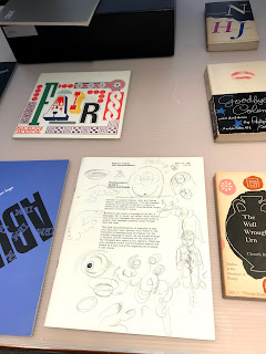
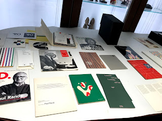
Today we visited the UMMA to see the Paul Rand collection they have that Franc donated. It was incredible to see Paul Rand's personal archive that he gifted to Franc, including his own copy of the IBM Brand Guidelines binder. I was in awe of the collection and felt so lucky that I was able to see it. This visit definitely helped inform my own designs and I can't wait to keep working on my logo for the Corner. Here are some pictures below from the collection viewing!
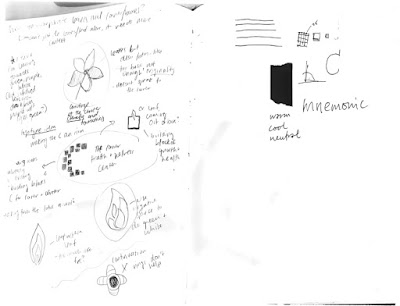
I also got some really great feedback from critique on Monday and am going to continue playing around with different iterations of my idea. Here is some of the feedback I received:
I loved being able to see Paul Rand's sketches. It gives us a little glimpse into who he was as a person
Paul Rand's personal copy of the IBM Guidelines!
I also got some really great feedback from critique on Monday and am going to continue playing around with different iterations of my idea. Here is some of the feedback I received:
- There might be too much negative space within the "C" mark because the text and the "C' are disjointed. Maybe place the text within the negative space more so they become integrated.
- Another suggestion: try moving the text under the "C" to resolve this
- Rather than using arbitrary squares and rectangles try and take the shapes from an aerial view of the the actual Corner and use those to create the shapes that make up the "C"
- Research mosaics and how that can be used in typography to get more inspo
- Try exploring how to create a shape from these blocks that doesn't make a literal "C"
- Green type is hard to read. Keep it purple
- Play around with the spacing between the rectangles and squares, and make sure the negative space between each is even
- "Health Center" needs to be smaller and fit within the spacing of "The Corner"
- Play with scale and number in the "C'
- Can make it more readable by eliminating some shapes
- Experiment with different styles of a "C." Maybe it can be less perfect
- Hierarchy in typeface
- Maybe use all caps or all lowercase
- Variation in depth with the squares and rectangles?
I am looking forward to tweaking my logo design with this new feedback and presenting it to Verssell next week. Will be back with more updates then!


Comments
Post a Comment