Project Update 4/15
I have completed a lot of work since I last posted! I would say almost all of my deliverables are done and I have started the outline for my booklet. Here's an outline of what I have completed!
Annual Report: still in the works but I am trying to figure out an effective layout using similar placement and shapes from my existing and recurring pattern that I've used throughout other branding materials. I am also trying to figure out how I can place the type in such a scattered composition in a way that respects hierarchy and readability.


Annual Report: still in the works but I am trying to figure out an effective layout using similar placement and shapes from my existing and recurring pattern that I've used throughout other branding materials. I am also trying to figure out how I can place the type in such a scattered composition in a way that respects hierarchy and readability.


Stationary System: I first developed the recurring pattern when designing for my stationary system. I wanted to keep the actual letterhead very clean and simple, however used the colorful pattern on things like the back of the letterhead and on my added folder design. To still keep the element of the pattern, but cleaner, I used the right angle rectangular shape on all of the materials sitting perfectly lined up in the "corner." Still some changes I need to make but the basic design is finished. I chose to add a folder seeing how that is one of the materials that the Corner actually gave us, so I thought it would be useful.


Apparel and Merchandising: In this category I have added more than eight items. I was trying to base these items on things that I think the Corner would find useful. My initial list began with a larger tote bag (to be used at the Corner Store), and then Franc suggested I have bag variety so I added a sinch sack that would be given at check out to all patients. Then I started with the clothing and designed a polo shirt for employees/staff, a fleece jacket, and a lab coat. I also think I will add scrubs to the list. I then designed a water bottle to be given to patients at checkout (along with the sinch sack) as a "goody bag," a tshirt for patients/clients, a bib for mothers, and an umbrella.
One thing that I found interesting that was pointed out today during critique is the idea of choice and flexibility and how the items should reflect this, not just the logo. I think that's important in giving the patients options as that allows them freedoms they may not have elsewhere in their lives. That is why I wanted to design a variety of items to be give in a "goody bag" or check-out package.


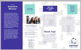
Website: This is not also a finished product. There are some changes I'd like to make in terms of navigation, and follow more to what the existing website looks like. I was trying to streamline a lot of the information, however I also want to be careful that I am not omitting anything important. There are also some color choices I'd like to fix to keep the eye flowing through the page more successfully. But this is where I'm at so far!

Outdoor Signage: This was also a bit of a struggle. The design I have so far uses the shapes and curves that make up the "C" to create a whimsical pattern, however I am not in love with it. I think if I want to keep my branding consistent, I should not venture into different patterns and compositions. I want to experiment and play around with this more to also see how I can represent what the Corner actually does through patterning. Maybe I include text within some of the forms advertising the Corner's services? Next steps I'm going to try and play around with the patterning I have on the folder design and in the 40th anniversary poster. I would also like to superimpose the final design on the building itself if possible to make it look cleaner.


Wayfinding: For the interior navigation, I wanted to organize the space in a better way. Though patients and clients will never be wandering the facilities alone and will likely be guided along the way, it is important to have a standard and cohesive navigation system. Using the key colors in my identity, I color-coded the different spaces based on functionality: communal spaces (like the kitchen and lobby) in green, offices and donor plaques in purple, and facilities in white. I also intend for these colors to be used to color-code the different spaces on all materials: maps, arrows, and the plaques outside of each room. The arrows I have designed are consistent with the right angle form I have used throughout the identity. I want each form that I use to be related to one another so there is a consistency in shape throughout.
I have also created a room naming system where each room number has a significance that will aid in the navigation of the building. The first number corresponds to floor number while the second corresponds to the amount of rooms on that floor. For example, room 101 indicates that it is the 10th room on the 1st floor.
Next steps for this aspect are finalizing the plaque designs and superimposing the arrows around the building and maybe even mockups of this.


Posters: I think this is the area that needs the most refinement (along with the annual report). I am really happy with the different options I have for the 40th anniversary poster, however I am still working through the services poster.
For the 40th anniversary I created the numbers 4 and 0 using the recurring forms from the C logo, like in the folder design etc. One thing that I am trying to make stand out with this identity is its flexibility. Because of all the different forms and shapes I am using, it leaves a lot of creative freedom with how to utilize the shapes effectively. The things I have been experimenting with are the use of photos, illustrations, etc. and type to replace some of the shapes sporadically. This allows for maximum flexibility when it comes to the different uses of the logo.
For my first 40th anniversary option, there are some photos that replace the shapes in the 40, while another option replaces the photo in the background. I think I like the background photo the most as it also brings dimension to the poster rather than leaving it with such a flat background color.
The services poster is attempting to do something similar, however instead the forms come from the enlarged "C." One point Franc and Alexis made today during critique is that the C might be too big. Because some of the shapes are cut off, it takes away from the readability and people looking at this poster who don't know to look for the C, won't be able to find it. For now I had placed random stock photos that I thought represented the services offered by the Corner, however there is no cohesion between all the photos so I need to be more intentional with how I use them.
I am going to play around more with the two posters and develop them into a series, where they both look like they could be part of the same campaign.
An additional poster I decided to design was based off of the image I have of the sinch sack. In my critique with Franc last week, he had mentioned how that image could make a great poster. I decided to use it as a marketing strategy that could be applied to billboards or other large platforms like that. I don't know if that is something that the Corner would be interested in or have the budget for, but that could be something that could be donated or gifted, and it is a great way to get exposure!


Next steps for the project is to of course finalize all of my deliverables and start laying out my guide. I think a lot of this copy can be used in my descriptions where I will be able to state my intention behind each design. One thing I also need to think about in my guide book that was pointed out a lot today during critique is to really pinpoint the different ways I've used the logo and decide on the exact ways to NOT use the logo. In my style guide section that will be important to differentiate between the Dos and Dont's.
I also keep talking about flexibility but I need to work on the logo more to see how it can be adapted for the different programs. I really liked how Alexis included this in her guide book so far about how she envisions her logo adapting to the different outreach programs so the Corner can have a consistent identity applied to all of their different streams of work.
I imagine the health and wellness in my logo being changed to whatever the type of program it is.
I also really want to make sure I think about the grid while designing my guidebook. Franc has really stressed this design element throughout the semester also with the showing of Design is One, where Massimo Vignelli talks about the use of the grid in design a lot. The Paul Rand book also had some interesting ways to think about it. I want to make sure every single thing I present is intentional and has meaning, so not only in the deliverables but the actual design of the book itself!
I will be getting A LOT of work done between now and next week!
Comments
Post a Comment