First Client Meeting
Had my first client meeting regarding my logo design! I think it went very well and I got some great feedback from Versell about the direction I can go in for my logo design. Prior to this meeting I worked on developing the "C" more and making my shapes more intentional, while also condensing the forms in order to have less elements as this would make the mark difficult to use in terms of scalability. I also played with color more and am interested in seeing how I can use purple more. For this critique, I liked the idea of combining a deep indigo with a teal green.
Versell gave me some interesting feedback, the most notable being his idea to use the boxes within the C as text boxes with "Corner Health" written inside multiple squares. I like this idea and can see this being something used in a large form of the logo, however in smaller forms this may not be as readable.
I also appreciated the feedback towards the logo design I had that used the squares not in the "C" form. Versell liked this one for its less literal qualities. This is definitely another one that I want to develop. Franc also mentioned a great idea about how this form could be incorporated through animation. I think this would be a great use of the form and it would be a great opportunity to challenge myself within that media, which is somewhat unknown to me.
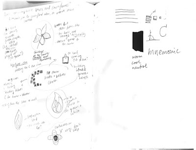
Here are the iterations I presented at the client meeting:


Versell gave me some interesting feedback, the most notable being his idea to use the boxes within the C as text boxes with "Corner Health" written inside multiple squares. I like this idea and can see this being something used in a large form of the logo, however in smaller forms this may not be as readable.
I also appreciated the feedback towards the logo design I had that used the squares not in the "C" form. Versell liked this one for its less literal qualities. This is definitely another one that I want to develop. Franc also mentioned a great idea about how this form could be incorporated through animation. I think this would be a great use of the form and it would be a great opportunity to challenge myself within that media, which is somewhat unknown to me.
Here are the iterations I presented at the client meeting:


Comments
Post a Comment