Branding Update Amidst COVID-19
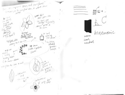
Hello! This is my first update since being home due to the Coronavirus. I've had a lot of time to reflect and finalize my logo. Since the client meeting with Versell, I have refined my final "C" logo. I felt that even though my "building blocks" idea had meaning, the squares and rectangles were somewhat arbitrarily placed. I have consolidated the form into 10 squares, with each square representing a different group of people that make up the corner: the doctors, nurses, patients, patients' children, donors, board members, prospective clients, staff, directors and volunteers. Each of these groups has a corresponding shape in the "C' form.
I have also begun to create a recurring pattern based on the forms I have played with, using the actual corner form, that I have chosen to be a repetitive motif through some branding materials (like the stationary, etc.), as the base for this design. I also think at this point my colors are final, however I have yet to play around with secondary colors for other supplemental material. I am hoping to figure this out as I start applying the logo to different materials and from there I will decide on the final design details for my identity guide.
I'm really excited about how my project is turning out so far and am very excited to continue!
Side note: I am interested in experimenting with gradients to see how I could incorporate this as a supplementary pattern/background
Below are the mockups I have started working on- stationary system and tote bag design
(I have also included the assets I have decided on)


Comments
Post a Comment